The Anatomy of a Pastorian Citation
by Jordan R. RogersCategorizing Pastorius’s Citations
As David’s previous blog post has already shown, there are issues in accurately reflecting Pastorius’s intentions for the Beehive with our current digital tools. The greatest difficulty in transforming this data from the page to the computer is the dissonance between digital and human expectations concerning data points. In David’s blog post, one can see how a single Pastorian citation could be multivalent in some cases, referring to multiple, loosely related terms in a numerical entry. This is difficult to replicate digitally, as a data point or node must be a discrete and unique entity.
Even with these limitations, however, one can begin to see patterns emerge in Pastorius’s cross-referencing that give us hints as to how he imagined his readers should engage with the Beehive. These patterns have become evident through the process of simply annotating the Beehive for digital use. Jehnna and David therefore had already hypothesized that Pastorius was employing two discrete types of intra-citation in his alphabetical and numerical word lists, what I have called here associative and complementary references.
Associative cross-references refer to citations that have somewhat indirect connections to the primary entry. This might be a case of synonymous meaning, as with the entry for “Scribe or publick Notary,” which cites “Secretary” immediately afterwards, as seen below.

Even though Pastorius lists many synonyms, including “Scrivener,” “Clerk,” and “Actuary,” he only intends for the reader to locate “Secretary” within his work, directing the reader’s attention to an associated word with its own set of citations and references.
Another type of associative reference can be seen when Pastorius cites a vaguely related term. So, when discussing snuff tobacco in his entry on “Snuff,” Pastorius references numerical entry 476, which leads the reader to the term “Sneezing.” Such a reference connects the material in question, the Snuff, with a physiological consequence of its use, Sneezing.

Some associative references are much more closely related, as you can see here in the case of the entry for “Sodomy,” which cross-references “Baudry,” “Incest,” and “Whoredom.”

Some of these citations also cite one another, signaling to the reader that Pastorius meant to present these terms as a tightly bound semantic grouping.
Complementary references, on the other hand, are meant to complete or finish the entry in question. These typically take the form of numerical citations at the end of an entry, though this is not always the case. We can see a complementary reference in entry 446, “Pope,” which cites entry 898 at the end of the entry.

Following that citation brings us to entry 898, again “Pope,” which itself cites numerical entry 1467 at its end.

Entry 1467 also happens to be concerned with the topic “Pope.”

This is a very clear-cut case of Pastorius’s intentions for the reader. Beginning with one entry, the user is meant to travel directly through a set of references in order to complete the original entry. In doing so, one finds further relevant information, including numerous intertextual citations and quotations of interest.
Anecdotally, the hypothesis of two distinct referencing systems appears to be borne out. But can we get better evidence?
Visualizing Pastorius’s Citations
In order to better understand how Pastorius employs cross-referencing, I visualized two datasets in the free and open-source network visualization software Gephi. Gephi allows users to easily manipulate how data points (called nodes) and connections (called edges) are visualized. The first dataset I visualized were the entries from image 2.122, a standard page in the numerical entry section of Pastorius’s Beehive. I first turned each of the page’s entries, as well as the listed cross-references, into nodes. I then tracked down each cross-referenced entry and added nodes for each of their cross-references, ad finem. The resulting dataset can be seen below as a table of nodes within Gephi.
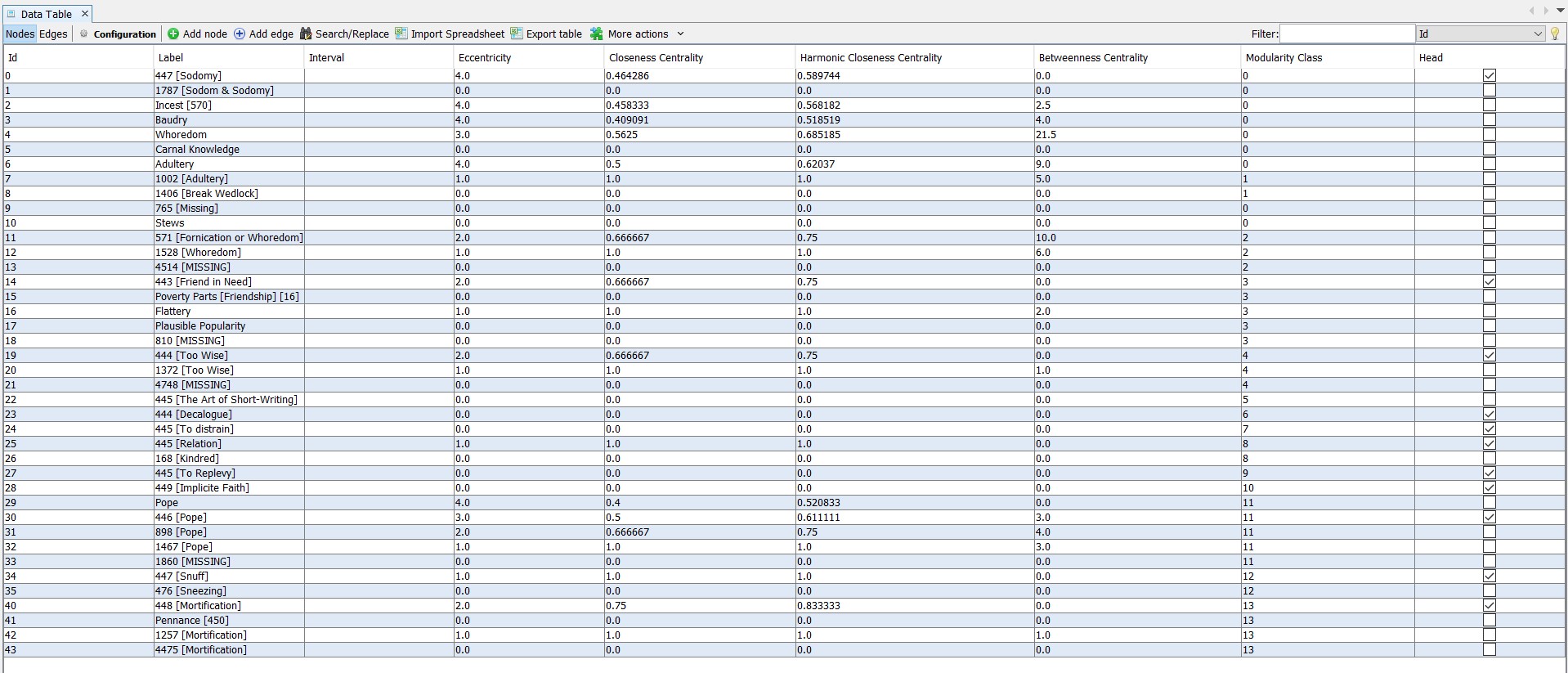
As you can see, the label type differs amongst the entries. I decided to keep the node labels as close to Pastorius’s original notation as possible. So, when Pastorius cites numerical entries, they are labeled with the number first and the referenced word following in brackets. When Pastorius cites alphabetical entries that are, in fact, numerical entries, the word is written first with the number following in brackets. Alphabetical entries are simply labeled with the word alone.
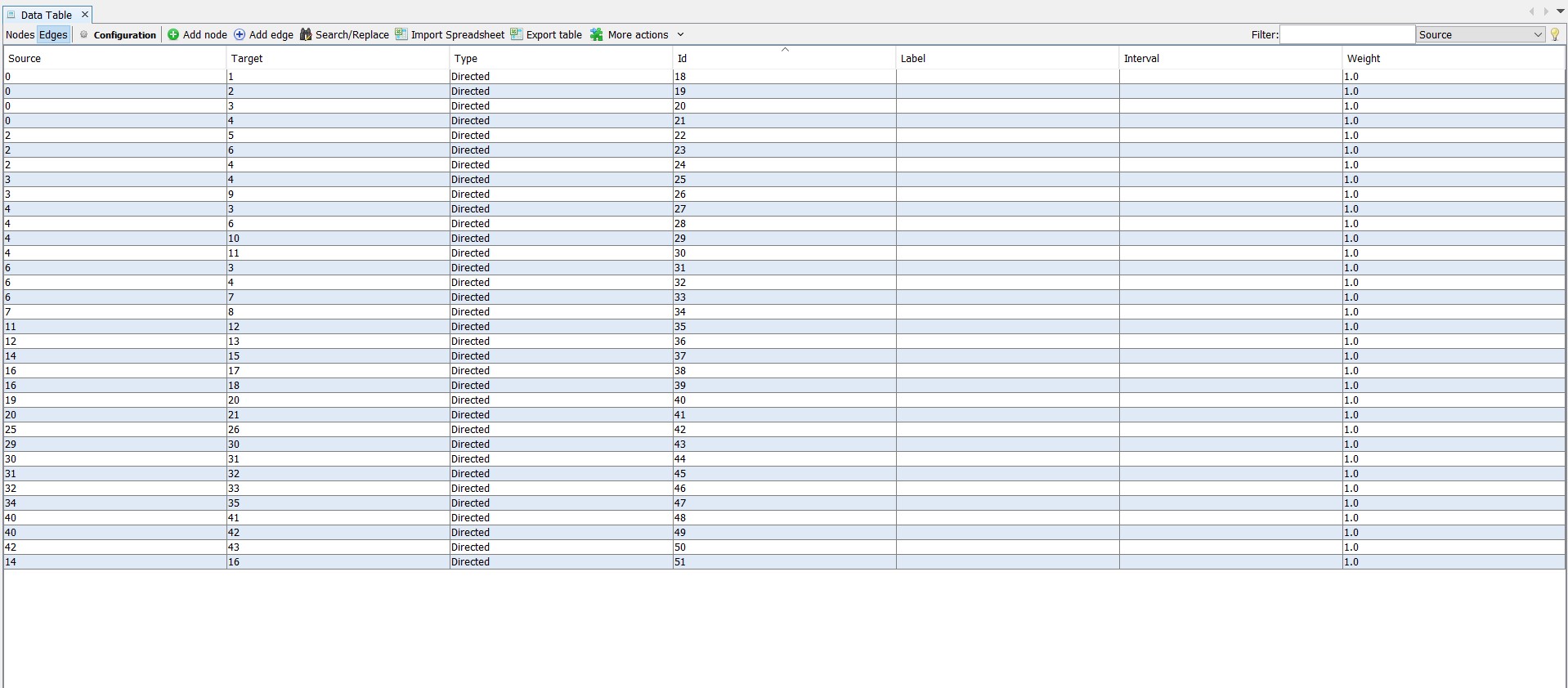
Next we create the edges, or, in other words, the relationships between the nodes. This is rather straightforward for Pastorius, as he tells us that he wants the reader to move from one place to another in his book through his cross-references. We can replicate these relationships by creating directed edges between nodes. So, in the entry “Sodomy,” when Pastorius writes “add Baudry,” we create a directed edge from node “Sodomy” to node “Baudry.” The end result of creating these directed edges looks like this in Gephi.
Now we have to visualize the data. When one first visualizes a dataset like this one, the result is merely a series of lines and dots with little revealing information for analysis or interpretation. We therefore have to manipulate the visualization in order to better understand what the relationships between the data points are. Visual manipulation of data is, by necessity, an imposition by the researcher (me) upon the data (Pastorius’s Beehive). As such, it is important to remember that data visualization choices are not are unbiased, but rather are, in fact, decisions made by researchers to prompt us to ask better questions and to offer novel interpretations of the data. With this in mind, it is important to log each step of the visualization process.
I first ran a computation on the average distance between any two nodes within the entire dataset, resulting in something called Betweenness Centrality. Basically, this gives us an idea of where any one node sits within a series of connections, and can be used to set the size of the nodes in the visualization. I then ran a Modularity algorithm, which automatically finds partitions, or communities, within the dataset. What this means is that Gephi can parse how related different nodes are to one another, based on their common connections to other nodes. We can set the Modularity coefficient higher or lower depending upon the number of communities desired in our visualization. For this dataset, I left the coefficient at the default setting, 1. Although I first set the sizes of the nodes to their Betweenness Centrality, I found that the resulting visualization was too misleading, making entries that were otherwise similar different sizes. I therefore instead set the size of the nodes in accordance with the number of degrees for each, which refers to the number of times a connection is made to or from any node in question. The result can be seen below. An even better visualization strategy might have been to correlate node size only with degrees out, or connections to other nodes, though ultimately that is not the decision I made (and further shows the inherent bias of data visualization!).
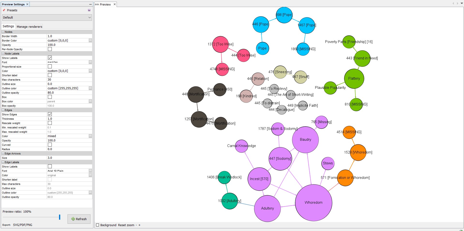
Here you can see that different communities have unique colors, while the size of each node denotes how many connections are made both to it and from it. The entries, as you can see, are discrete networks, as we would expect, each with their own data community (note: I did not treat the entries on the original page in a different manner from the other nodes in the set). The most interesting development can be seen in the sub-network for 447 [Sodomy]. As you can see, Gephi recognized three data communities in the set. The primary data community consists of what appear to be associative references, while the two secondary communities are composed of complementary references. At least as far as Gephi is concerned, the relationship between these data points is different enough to warrant acknowledgement.
To see if I could replicate these results in a larger dataset, I repeated the above methodology for the entry “Mortifying” alone. The end result for this dataset is 47 nodes and 68 edges, visualized below with the same parameters as above, aside from reducing the modularity coefficient to .25 in order to encourage the algorithm to identify more communities.
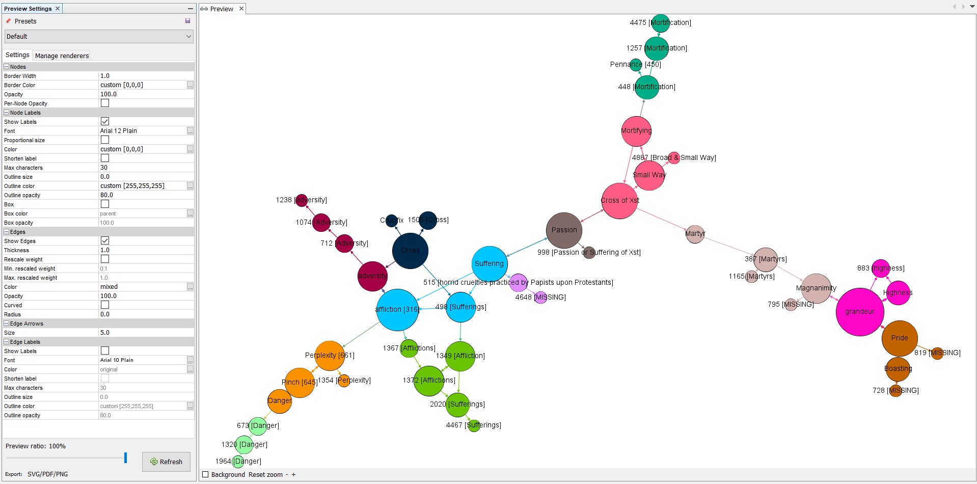
If one follows the directed edges, denoted by arrow paths, from Mortifying out to other nodes, one can see how the change in node color appears to reflect a shift either in semantic grouping, or in reference type, depending upon the circumstances. When a linear relationship is established between three or more nodes alone, Gephi identifies those nodes as a community. These cases can be considered communities of complementary references. Similarly, if a node has connections to two or more distinct groupings, it forms its own community as well, visualizing movement to different semantic groupings through associative references.
What can this little journey in data visualization tell us? On the one hand, we have to remain skeptical when comparing the visualization of our dataset, as problematic as it is, to that of Pastorius’s Beehive. As I mentioned at the beginning of the blog post, digital data for the Beehive do not necessarily exist in a one-to-one relationship to the analogue data of the book, as much as we strive to make that the case. Nor is the visualization of the digital data a passive exercise; as we have seen, I made a series of decisions on how exactly the information should look that the data itself did not demand.
On the other hand, these visualizations offer us another type of (admittedly circumstantial) evidence for understanding how Pastorius thought about the connections between the word entries in his commonplace book. We will need to apply this same methodology to many other, both smaller and larger, datasets within the Beehive before coming to any definitive answer, but these preliminary findings are encouraging in that they hint towards the existence of a systematic and sophisticated framework for citation and knowledge connection within the Beehive. Always more work to be done!