Basics
Basics | Binding »
Islamic manuscripts are, in large part, written in Perso-Arabic script languages which include Arabic, Persian, Ottoman Turkish, Urdu and other languages.
The script is read right-to-left, which means that when you open a book, the spine will be on the right and the fore-edge, meaning the opposite side, on the left. You then read from right-to-left.
The script itself consists of 28 individual letters and is designed to be written joined as a cursive unit, which means that the letters will change shape slightly (or a lot) depending on where they are in the word. Each letter has 4 shapes: initial, medial, final and isolated (unconnected). You can see how this works with the letter jim (corresponding to ‘j’) in the picture below.

For Arabic, there are only 11 shapes for the letters, even though there are 28 different letters. Points (dots) above and below the letters help distinguish between letters with the same shapes. See for example the three letters below (ba, ta, tha)

Each letter has the same basic shape, but they are distinguished by differing numbers of points above and below.
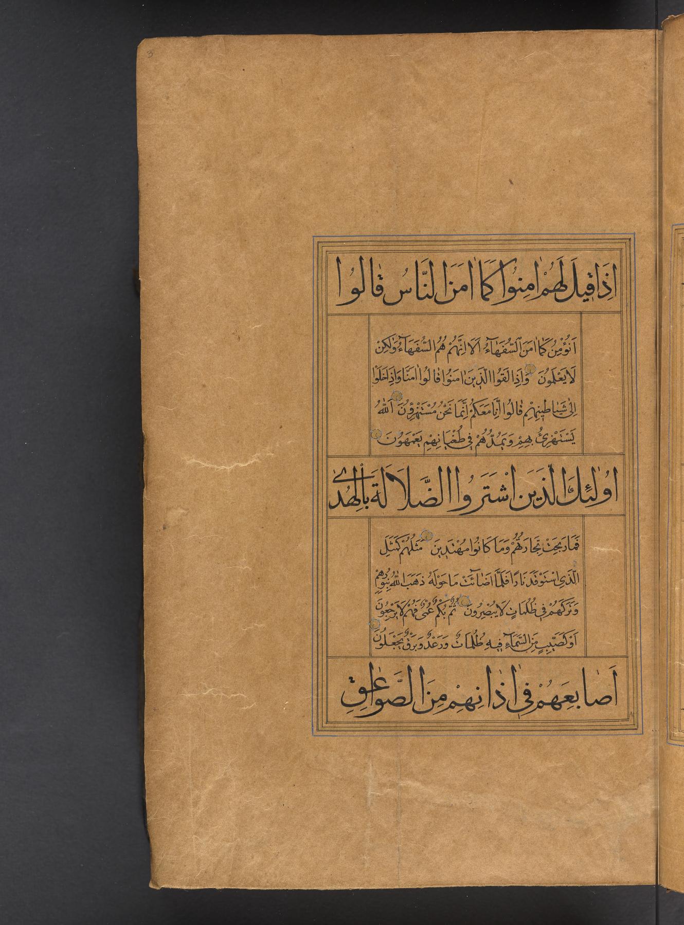
Another thing you might notice when looking at an Arabic, Persian, or Turkish manuscript is other marks floating above and below the line of text. These are short vowels and they help you pronounce words correctly. Writing in vowels is not a requirement to be able to read the text, however, and many times they are left out of the manuscript copy since people who can read the languages know how to pronounce words without them. The one exception to this is the Qur’an, which is almost always copied with the vowels in place. Below is a page from a copy of the Qur’an. You can see the vowels as short lines, loops and an open circle above or short lines below the line of text. Do not confuse vowels with the points (dots) on the letters. These are two different kinds of markings and serve different functions.
 (Free Library of Philadelphia, Lewis O3)
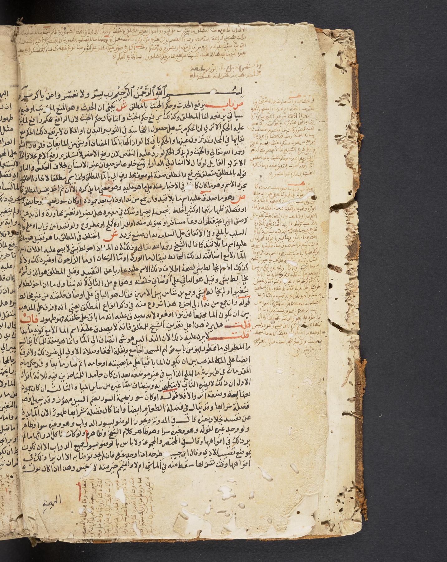
Please also note about Perso-Arabic script that there are no capital letters and no necessary punctuation. There are no paragraphs and no distinctive opening letters. In order to navigate a text, therefore, rubrications and overlining become important. Rubrications (also called rubrics) are words in another color (red, most often) or in a slightly larger size that help a reader figure out where something new begins. Overlining is like underlining, but with the line on top. It also helps catch the reader’s attention and direct the reading. A page with examples of both is below.
In the photo, you can see the red words and letters help the reader determine that this text is a commentary. It contains both the source-text (the text to be commented upon) and commentary (what the author says about the source-text). The red letters help show the reader which parts are source-text and which are commentary. It is like writing ‘S’ before each portion of source-text and ‘C’ before each commentary. The overlining serves here to highlight quotations. Another type of red mark, an overline with a little circle at one end which is particular to this manuscript copy, works like a footnote marker drawing the reader’s attention to the marginal notes.
See if you can find all three types of mark in the image below.
 (Penn Libraries, Ms. Codex 27, vol. 1)
That’s a very basic intro to Perso-Arabic script. You can do the Basics exercise now, or go back to the top and continue to other pages as you like.