Layout
« Substrate | Layout | Scripts »
Islamicate manuscripts are generally laid out in one column with fairly wide margins on the three outer sides for marginal commentary and notes. The exception to this rule is poetry, which is generally written in two or more columns.
Prose
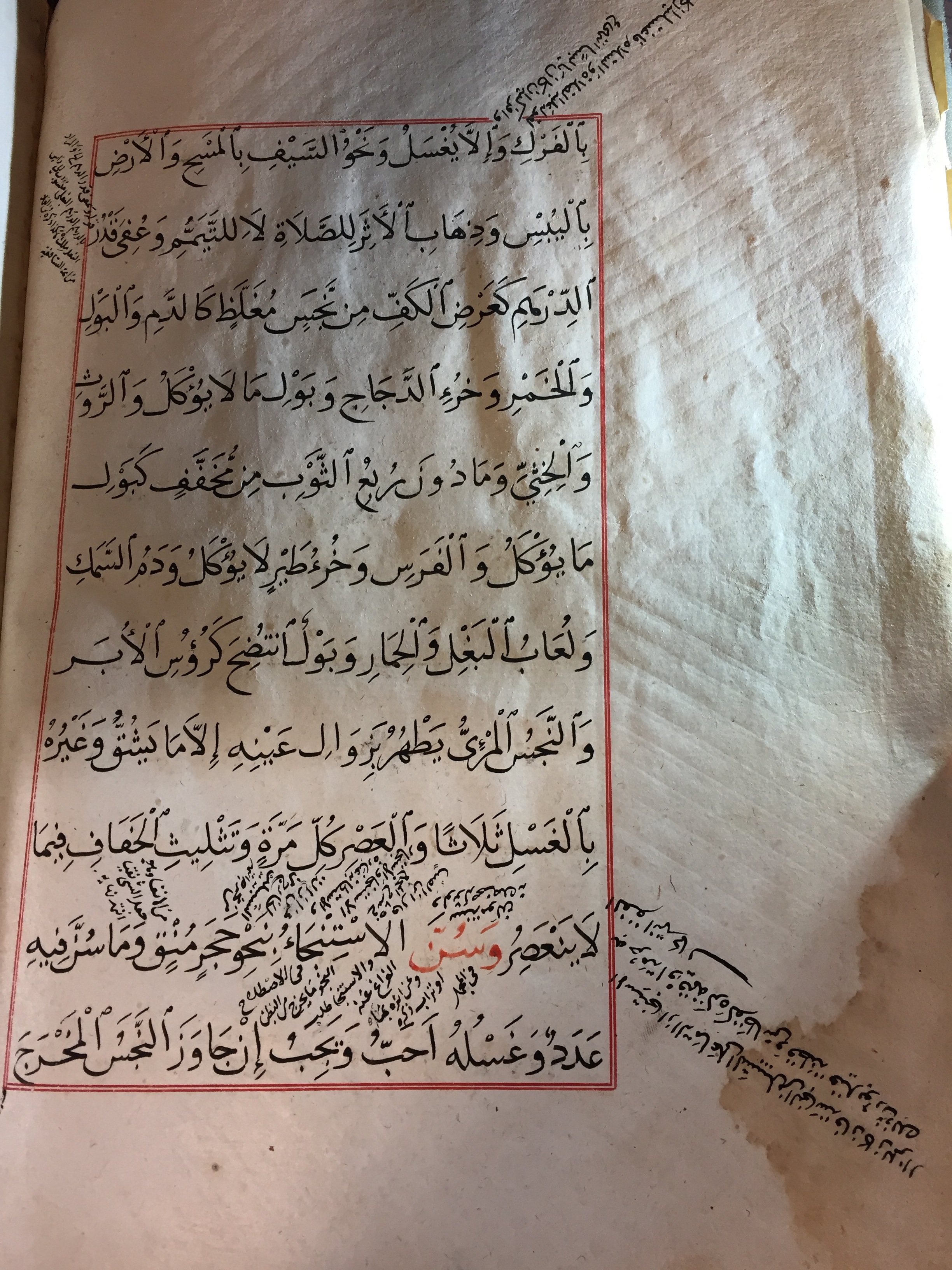
Below is an example of a fairly standard prose layout with wide margins all around and marginal lines and annotations. Note that the main text is written into the red box on each page. Those red rulings, called border-rules, often appear in manuscripts copied after the 14th century and set the textblock (the main text) off from marginal notes. You can see both the border-ruled main text and many marginal notes in the photo below.
 (Image: UPenn Libraries Ms. Codex 1896 from OPenn)
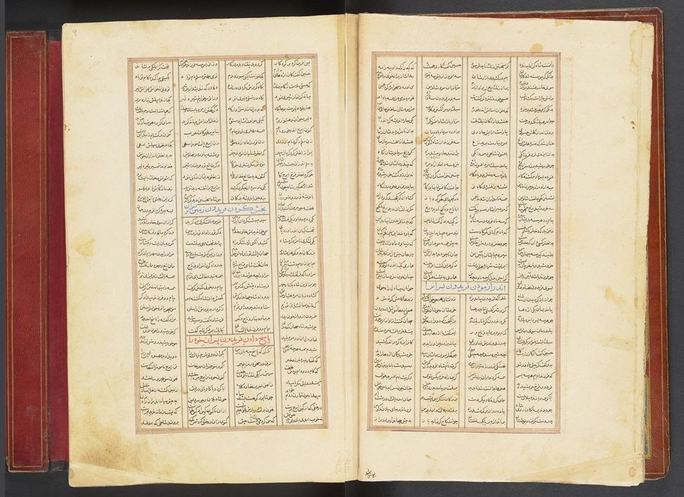
From the same manuscript, here’s a photo of marginal rules. Lines and columns are ruled, so that when the scribe copies the text, the lines come out straight; this was generally done in blind (without ink). These rulings were made using a frame rule (mistarah), or ruling board which is a piece of cardboard with threads sewn onto it that mark the lines. It is then put under a page and rubbed over with a smoothing device to create indentations in the page. Those indentations are the line rules.
 (Image: Kelly Tuttle)
Poetry
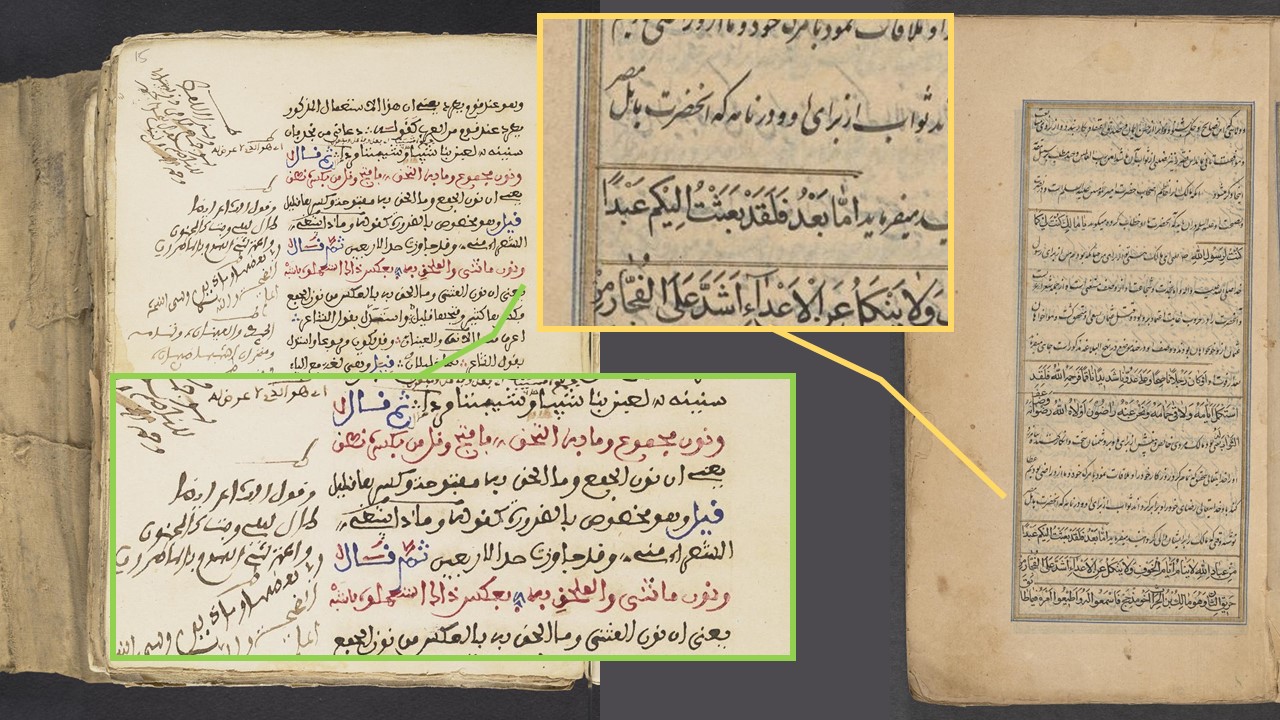
For poetry, the written surface is laid out in columns, because poetry is written in verses. Often, the columns are ruled in ink to separate the individual verses. This makes the work easier to read and keeps everything tidy. Here is an example from a copy of the Shahnamah held at the Free Library of Philadelphia.
 (Image: Free Library of Philadelphia Lewis O 53 from OPenn)
Other layout features
Rubrications, which you can see in red and blue in the image above, help direct your reading; they help draw the eye to guide words, or section divisions. They are often in red, but sometimes in other colors like blue, green, and gold. Sometimes, rubrications are in a larger script. In the photo above, the rubrications are summarizing and anticipating what happens in the text, which helps readers navigate.
Color can help in other ways, too. For example, sometimes, poetry will be mixed in with prose, but it is still usually set off by some kind of marker. This can be words (the actual word ‘verse’ or ‘poem’ before a poem begins), or rulings, or simple sets of three red dots in between each line. Other aspects of color can indicate something about the type of text as well. For example, commentaries often have the source-text in red and the commentary in black as in the left-hand image below. The right-hand image shows another way of distinguishing source-text from commentary using overlining, which is, as it sounds, putting lines over a word. In the image below, the call-out boxes show enlarged details of the source-text in red (left) and the overlining (right).
 (Images: UPenn Libraries, Ms. Codex 1916 and Columbia University RBML MS Or 123 from OPenn)
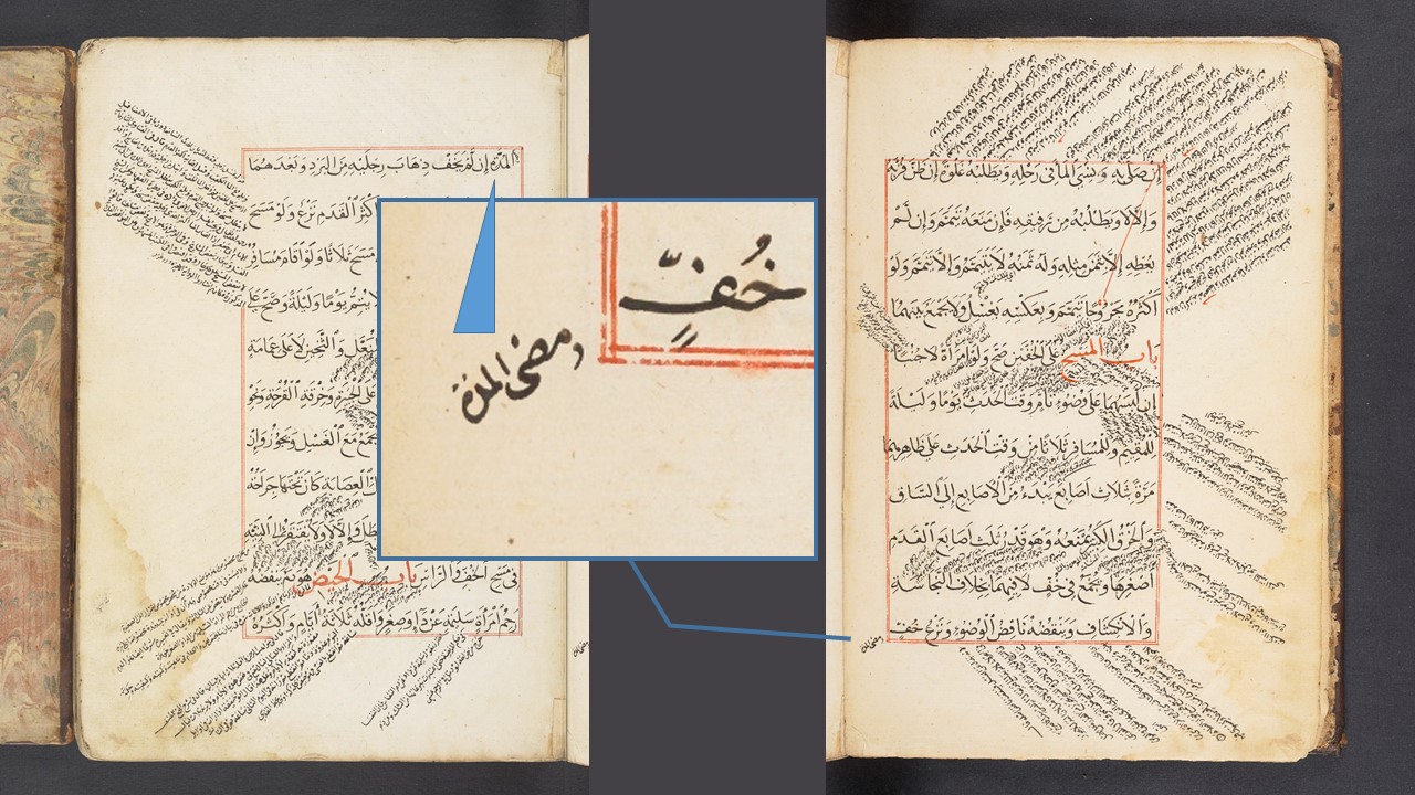
Another aspect of layout that we frequently see in Islamic manuscripts are catchwords which often appear on the back of every folio, usually in the lower margin toward the left side. The catchword is a repetition of the word that will appear at the top of the next page. Since manuscript pages are generally not numbered, the catchwords help keep pages in order. In the image below, you can see the catchword enlarged with a blue arrow pointing to the corresponding first word on the next page. Those two words should match and here they do.
 (Image: UPenn Libraries Ms. Codex 1896 from OPenn)
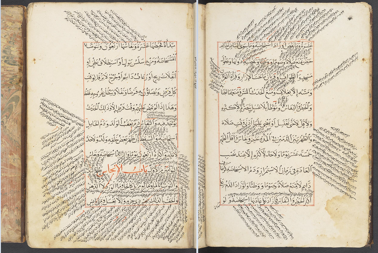
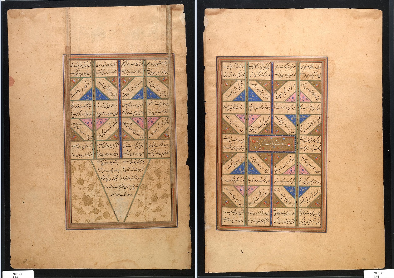
A final aspect of layout that you most often see in poetry, are verses writtten on the diagonal, creating a zigzag pattern on the page. Such verses are used to adjust space on the page. This form of text manipulation was often used to leave space for an illustration and to make sure that verses closest to the illustration relate to what is depicted. For the reader, the angled lines tells you that something is coming up in the manuscript. In the image below the end of the text is coming up, so the lines have been written at angles both to announce the end and frame the colophon, but also to manage the space of the last opening so that it is laid out neatly and fills the available space.
 (Image: Penn Museum NEP33 from OPenn)
That concludes the introduction to layout. Do the Layout exercise now, or jump to any other page you like.
You can also go check out the References, other SIMS Resources or look at the Glossary for more photos.